Source: The Conversation (Au and NZ) – By Beck Wise, Lecturer in Professional Writing, The University of Queensland
You might have scrolled right by Annastacia Palaszczuk’s recent quote posts if you saw them on Instagram – just another lifestyle influencer posting a “deep” quote – but when she (or her media team) reposted them to Twitter they stood out as belonging to another platform.
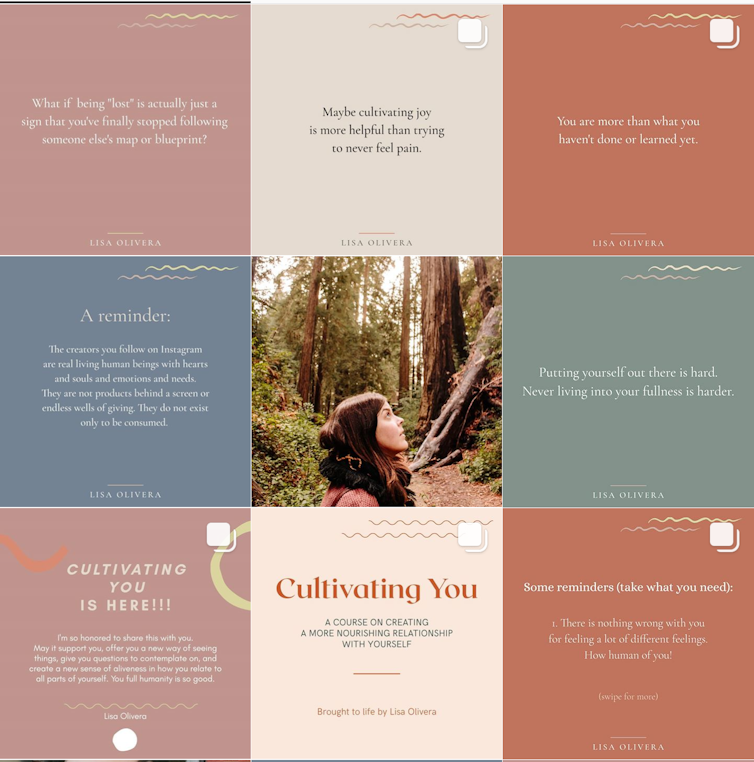
Blush pink, serif fonts, minimalist art – this isn’t what we expect to see on a politician’s feed. Instead, it all screams “Insta”.
But what is an Instagram aesthetic – and what does it do for Palaszczuk in the midst of a public health crisis, and the lead-up to an election?
Parsing Insta aesthetics
On Wednesday, Palaszczuk posted an crisp image above across her social feeds, including Twitter, Instagram and Facebook: a blush-pink background with the text “I will do everything I can to keep Queenslanders safe”.
Above, line art of Queensland’s borders; below, Palaszczuk’s name and “Premier of Queensland”, bolded and in all-caps.
This post – the latest in a series of three quotes posted since July 24 – leaps out from a grid that mixes up busy but low-contrast infographics with the vivid colours of the Queensland outdoors.
As readers, we recognise this form instantly: this is an inspirational Insta quote. We know that because specific visual elements work together to help us understand and categorise the image.
First up, the background colour. A post on July 31 used duck-egg blue; this latest is a soft blush pink, maybe not quite millennial pink, but definitely in that ballpark.
The pink is a muted Queensland maroon used across the account, and the flat texture makes it stand out from the busier backgrounds on her illustrated announcements.
Then there’s the font choices. Serif fonts read formal, literary – and as some users have commented after Instagram added serif fonts to Stories this week, “pretty”.
Using a serif font for the quote makes it seem like something we’d read in a book, elevating its importance. The blocky serif font for the credit reads strong, powerful and modern, as does the use of line art to replace the silhouette of Queensland used in earlier posts.
The vertical and horizontal centre alignment is also characteristic of Insta-inspiration quotes, which work best when they’re designed to transition seamlessly across the platform: cropped to a square for the grid and to a vertical rectangle for Stories.
When visual elements like text or icons are aligned to the edges of an image in one format, they look wrong when the edges move – like when you extend a square pic vertically to fill a phone screen.
This is what makes an earlier quote post look like it belongs on Twitter, not Instagram: the Queensland silhouette sits in the top right corner of the horizontal crop on the Twitter timeline, but floats when the image is extended to a square on Instagram.
Embracing these aesthetics softens a strong message, helping Palaszczuk navigate the double standards applied to women in leadership.
Read more: ‘Expect sexism’: a gender politics expert reads Julia Gillard’s Women and Leadership
The strong, direct phrasing foregrounds Palaszczuk’s leadership and commitment to Queensland’s security, while the feminine influencer layout helps dodge misogynist accusations of unladylike behaviour.
Genre tells us how to read
These design choices are all examples of genre conventions: visual and written clues that help us know how to read and understand a message.
For politicians, committing 100% to social media genre conventions is a risky game.
Done well, you’re Alexandria Ocasio-Cortez, serving up voter education as she cooks mac and cheese, or sharing her notes for her iconic response to Ted Yoho.
Ocasio-Cortez uses a different, less obviously curated genre – it works because it feels authentic, relatable and consistent.
Miss the mark and risk your mentions clogging with Steve Buscemi gifs: “How do you do, fellow kids?” So why risk it?
Palaszczuk’s quote posts don’t feel #OnBrand amidst the outdoor photo ops, illustrated announcements and daily infographics that characterise her grid.
But by playing on readers’ implicit understanding of Instagram genres, they position her as a social leader.
As readers, we recognise that a flat pastel background, a prominent quote and maybe some minimal art signals a particular genre.
When we see a post go by on our timelines that looks like that, our understanding of genre conventions primes us to expect an inspirational quote from an historic figure – a Martin Luther King, a Gandhi, an Audre Lorde – and then signals to us that Palaszczuk belongs in that list: a world leader whose words can guide us in an unprecedented public health crisis.
The text says: “I will do everything I can to keep Queenslanders safe”; the subtext says: wouldn’t you vote for someone like me in October?
– ref. Pastel colours and serif fonts: is Annastacia Palaszczuk trying to be an Instagram influencer? – https://theconversation.com/pastel-colours-and-serif-fonts-is-annastacia-palaszczuk-trying-to-be-an-instagram-influencer-143996