Analysis by Keith Rankin
To get a correct picture, we need regional data – indeed sub-regional statistics – because the virus does not respect political boundaries. Unfortunately, it is very hard to get regional data from European countries. The Johns Hopkins data – most widely used by the media (and used in this chart) – has regional data only for USA, China, Canada and Australia. And this dataset is weak, in that it does not give the all-important per capita data.
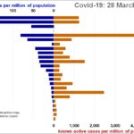
Today’s chart shows the latest recorded deaths. Not surprisingly, Italy and Spain remain the highest. China’s per capita incidence of Covid19 remains very low. New York is the new big story. The chart shows the death rates there, and the deaths in greater Seattle (King county, Washington state) where the first large cluster in the United States took place.
Of the remainder, Netherlands is a particularly bad case that has largely gone underneath our radar, with high death rates relative to known cases. United Kingdom rates are just starting to explode. I am also concerned that Canada has a very long way to go. Iran remains highly problematic, with a very large undercount of cases.
And watch Turkey.